Another magazine swiped from a co-worker before they arrive at the office…. Paste’s covers have always made me pick it up, but I rarely actually buy the magazine myself. I appreciate they’re trying to really build their own strong identity and I think it’s working on their covers, but I think perhaps they’d do themselves a service by making their interior templates look a little less Rolling Stone, especially in their choice of fonts and colors and the use of keylines of varying widths and colors all over the pages. But back to the cover, many times I don’t think they’ve made their logo contrast enough with whatever is on the cover to stand out on the newsstand or even be readable, and seem to remember several covers that use an abundance of browns, dark reds and yellows, that just completely dissappear when surrounded by other magazines. This issue is different… a simple iconic image, dark background with white-ish type on the coverlines and banner on a dark background, and a lot of space make this the most dramatic and eye-catching cover I’ve seen from them yet, I really hope they continue down this road. Looking in the top left corner, there’s one of these ‘*’ things which I’ve used myself in the past and am equally guilty of abusing without even thinking about what it actually does, which I think in the case of Paste’s cover is nothing. Designers seem to love slapping on plus signs, stars, flashes and all kinds of crap which I don’t think they’re really thinking about, they’re just sheeping their layouts in order to try to keep up with what’s ‘current’. But I digress, this Paste cover is awesome overall, and they should pat themselves on the back for producing it.

I mentioned above the interior layout and template, but they also make use of some charts and infographics, some of which work, some which don’t… and they also have one of those website contents pages which seems rather wasteful here considering how little they seem to have on the page itself.


The contributors page highlights some issues with hyphenation and justification. There’s some stretching of words causing some ugly white space between letters to fill an awkward column width which looks like it could have been easily fixed with a little deft editing or simply justifying left, but maybe this page, like the table of contents is one of those pages that’s knocked out at the end of the production cycle, one of the last things to be done, which is a problem I’m trying to address at my own magazine too!

I like this spread on ‘4 to Watch’, but something also bothers me about it. It seems like it needs to go through another couple of design revisions, there are some drop caps hanging over the line of copy below them, the stat boxes at the start of each entry are really drab looking, and as these are presumably lesser-known artists, I’d like to have seen a little more emphasis on their names, and maybe some album art too (who knows, they may not have album art available). Finally, I think this page highlights the weaknesses of some of their regular templated font choices, particularly the one used on the top left for ‘4 to Watch’. The word ‘to’ just looks weird, and kind of ugly compared to the really clean, helvetica-ish font used immediately below, or the more western looking font immediately above (‘Scrapbook’).

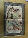
For all my criticsm however, I have to say this next piece blew me away. It’s an illustrated ‘Field Guide to Animal Bands’, by the ‘Paste Faunomusicology Society’, and has four illustrative/infographic spreads that require you to turn the magazine sideways to read. Each is broken up into a category – ‘Jungle’, ‘Insects, birds & rodents’, ‘Aquatic’, and ‘Extinct’, and contains an illustration of a type of animal which is labelled and representative of a band talked about in a blurb at the bottom of the page. I think the illustration is a mixture of ink, watercolor and photoshop enhancement, but combined with the old-fashioned field guide look of the layout, is just incredible to look at. There’s actually a lot of illustration used throughout the magazine, and all of it is really nice, it’s good to see a magazine which uses multiple illustrators to such good effect. See the four spreads below, click to make larger (sorry for the picture quality!). The illustrator’s name is Jeremy Holmes.


Recent Comments